The Bear Trap of the Centurey (Cont.) and how to use fib ratios
(Remember to click on a chart to make it bigger.)
This is what the casual onlooker sees when he looks a longterm chart of Standard&Poor 500
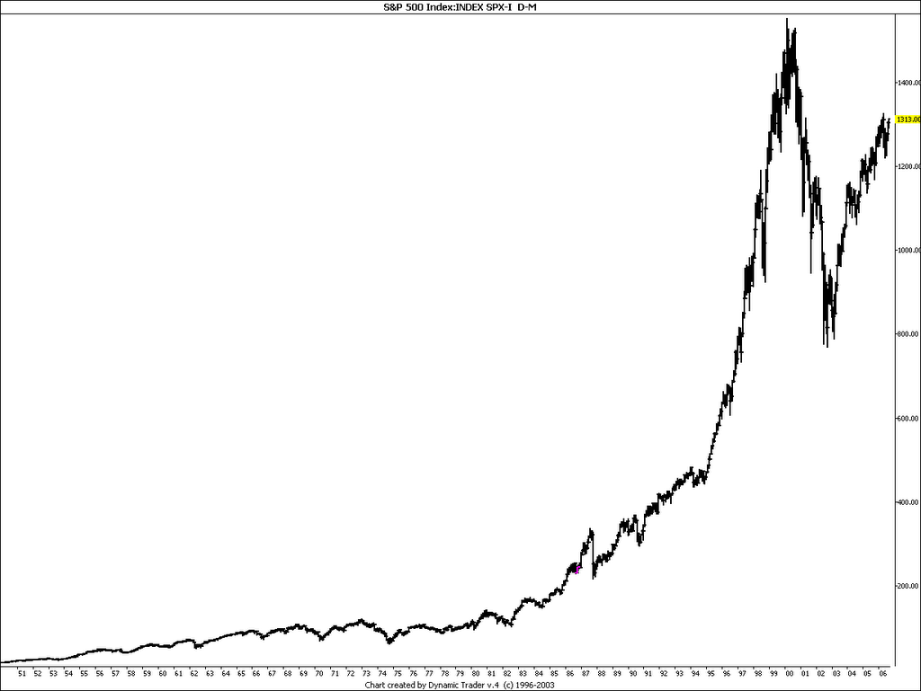
Doesn't give much of a clue does it?
Ok, let's change to logscale and find some interesting price points.
What we are looking for is energy. Where price movements have been stopped, reversed or accelerated. (It takes energy stop a movement). We are looking for relationships and trying to find if there is a relationship and if it's important now .
We have some obvious points in time.
The 1974 bottom (where the last gigantic bullarket started)
The 1987 top
The 1987 bottom (crash)
The 2000 top
and
The 2002 bottom
One chartpoint that is not evident, but I have found important, in time analysis, is the feb/march 1995 upside break out (where the 1995 up crash started)
Lets look at a log chart and see what it looks like.
What we do, is to measure the advance from 1974 to 1987 and compare that to future development, measured from 1987 bottom.
What we see, is that there is a perfect connection between thar advance and future important chartpoints including today.
In other words - where we are now is energy wise connected to the 1974,1987, 2002 and 1995 important points in price. A break of the upper resistance is very important.
In the next chart we do the same measurement but now we expand the price from the 1987 top
We now can see how also the 2000 top is connected.
Let's look at time and trendlines.
1st we connect the advance from the 1974 bottom to 1987 top and add 50% time.
We end up at where the "1987 bottom->1995 top" advance stopped.
Add another 50 % and we are in the middle of the 2000 top.
Add another 50% and you end up at the month of November (remember this is over a 32 year time span +- 2 months should be OK - besides we have to take start/end of month into consideration)
If we connect the 1987 bottomwith the 1995 top (stop) and draw 2 parallell lines and connect one with the 1974 bottom we find that it is well fitted to the 1987 and 2000 top.
Another line connected to the 2002 bottom, works as a supportline to price right now.
Breaking the line should be very negative to stocks. We are connected both to an upcrash (-95) and a down crash (-87)

The long trendline in the chart above has in the chart below been modified, so it instead connects the 1974 bottom and the 1987 top.
A parallel line has been added to the 2002 and 2003 bottom.
The first one was violated in June and July - by the the decline from May 2006. We were, howeer saved by the 2003 T/L - a good sign reinforcing the "trap" scenario.
If we conncect in time the -87 top with the -95 breakout we have a perfect fit for a July 2006 bottom.
Compare that with John Murphy's interpretation of the 4 year cycle and blow up further down)

Let's look at the other trendlines at the top (green and blue). There are two ways to draw them. Either conncecting points 1 and 2 or 1 and 3.
Normally I prefer 1 and 3, however, if we connect 1and 2 and draw a parallelline from the Jan -73 top we have a perfect fit with the -76 top and decline.
Now look below at a blow up of the chart and the 2006 situation.
Either way you draw the trendline be have broken out above.
But perhaps more important - if we use the 2000 line, we can se that it crossed the "1-2" t/l from the top exactly in July, where we rose back above the 2000 trendline. That cross of lines was a "sweetspot" not extra strong resistance from two trendlines, which is normal. We are also above previous monthly high. And only 14 points below daily high.

Lets look at a daily chart of DOW.
The 88.6% retracement is the absolutely last point where price can stop if it's only a correction we have been witnessing.
Friday we broke that level and closed just above it with good volume. Hence, it suggests higher prices to come.
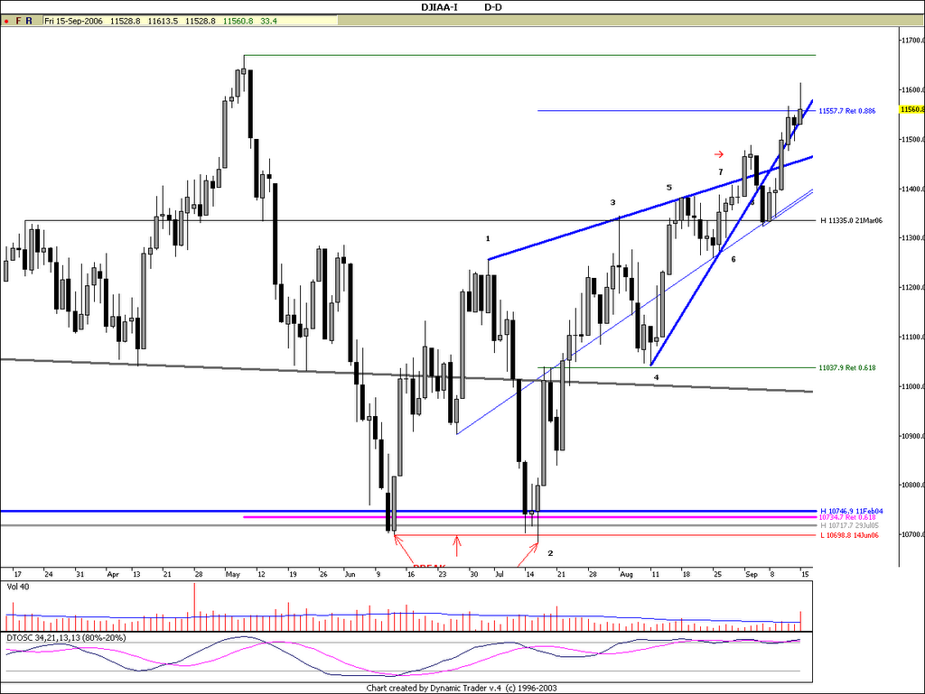
One might argue that the chart above indicates a top instead of break out because of the volume.
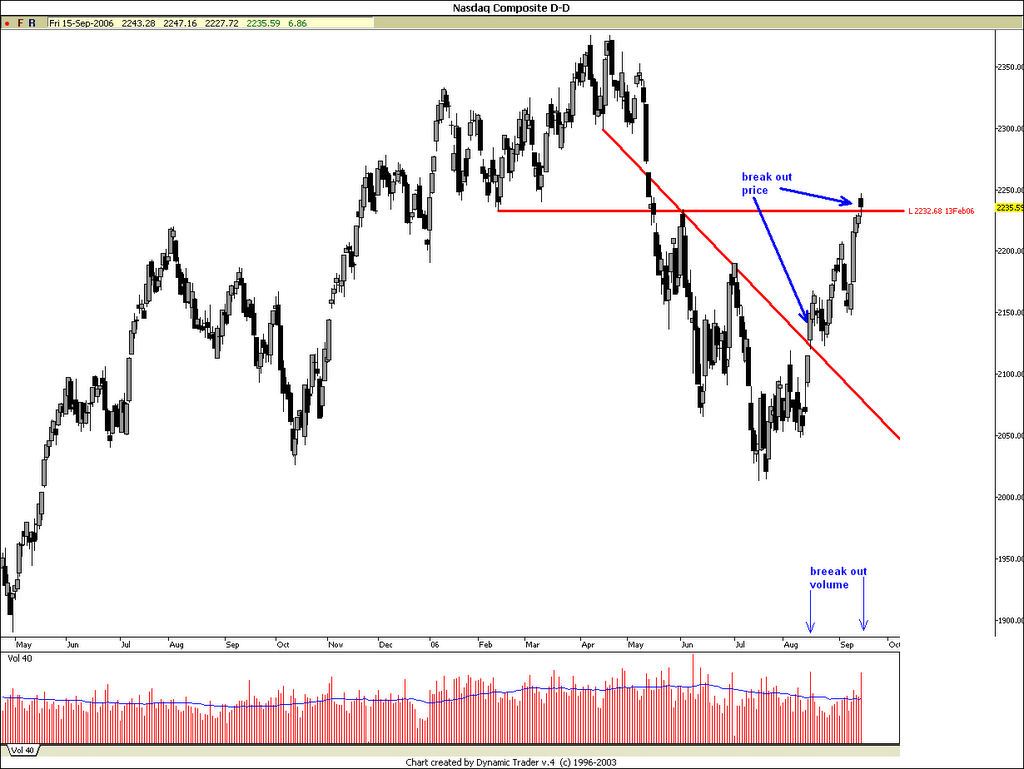
However, if I look at the COMPQ chart below, I would argue that volume suggests an upside break out in stocks (break out of what?).
Well, -break out above old top and breaking an old bottom. Check volume.
Note, this time, the crossing of the two line was not a "sweetspot", but genuine resistance (one never knows- the best is to be prepared for both...)
Conclusion.
My theory is that since 2004 the whole psychology has been geared for a top at the green trendline (3 charts above) at point 3. With a decline starting in May and accelerating this fall. That's what "everybody" have been prepared for. However Aug 15 everything suddenly chaged changed at 8.30 AM with the release of the producer price index and confirmed on the 16th with the release of Housing Index and Industrial Production data as shown with the charts in my previous Bear Trap analysis at
http://www.traders-talk.com/mb2/index.php?showtopic=58894&hl=bear+trap
or saved as a worddocument at (however if you read thsi you have probably read the first one as well:
http://www.badongo.com/file/1345520
(warning, had complaints from a few people that have experience warnings from their spyware software after downloading the document - nothing dangerous but irritating)
In connection with the conclusion above, let's see what Carl Swenlin said today, when he presented this chart on www.stockcharts.com

(this chart)... is of the Rydex Cash Flow Ratio*, which I featured in an article two weeks ago. Note that the Ratio remains oversold (reflecting strong bearish sentiment), in spite of the fact that prices have continued higher. The condition of the Ratio is caused by a combination of aggressive buying of bear funds and timid acquisition of bull funds. This situation is extremely unusual, and I believe it must be relieved before we can expect a significant price decline. Relief will come when the bears give up and the bulls become more aggressive, ultimately causing the Ratio to move back up toward the top its trading range.
![]()


No comments:
Post a Comment