Is the Gold correction over?
You can make the charts bigger by clicking on them (the back arrow to return to blog)
On December 27, 2005, 5 days after winter solstice I wrote in another blog (scroll down to Dec 27) http://kursus.textdriven.com/soo/blog/ a piece with the same heading. It was 3 trading days after the low and Gold took off for it's 200 dollar journey, making a high on May 12, 2006.
Then falling almost $170 in 32 calendar days and seemingly making a low 4 trading days before Summer Solstice 2006.
6 days after that low I am assuming with some confidence that the large correction is, again, over and we should be heading higher.
Seasonal charts suggest positive Gold until the end of September.

OK, so we have a seasonal chart suggesting we ar going higher. Why are we not going lower?
On a daily chart of June gold we can see support at ttrendlines and the "final" fibonacci support (0,886).
The DT oscillator shows the lowest value in the June contract since it began trading in June 2001, indicating an oversold condition, which not in itself indicate a turning point or support. However, long term MA has been crossed and the short has turned up.
Long Term chart is more intersesting
This is cash Gold and we are slicing up the advance from the 1999 low to the 2006 high.
We find that the correction has stopped at the geometrical 33% retracement level of the whole advance and the 50% level of the last push up. Resting at "solid"(?) support.
It is difficult to find much more chart support for gold this time, Silver however, shows distinct support characteristics.

We will also search for help with the GalacticTrader software to find out what kind of information that is hidden from the general public. We are mostly looking for clues that suggests the timing is right.
In this first chart we choose to look at the period 1981-1991 and record the dates when the planet Mars stood at 90 degrees to the planet Jupiter. Those dates are painted blue in the chart.
Why would we do that?
Well, if, in the past, Gold has had a habit of turning at the days, or close to one of the those days, when we had the aspect, probabillities would be that it would/could happen again.
Let's look at another chart, this time from 1989-1993.
In my view, it looks like, in the past, in periods, Gold has turned it's direction around these dates. At some instances a rather steep rise has followed. Especially in the chart below. This is not something we believe we are seeing. what we see is what happend.
The present situation, is that the same aspect was present 4 days ago.
Larry Pesavento has researched this cycle, which is mathematically connected to fibonacci numbers and ratios, and describes it as very accurate and working consistently year after year. He also writes: It is best to use lunar sycles to pinpoint entry.
This weekend (6/25) we had a new moon.
Another planetary cycle he discusses is the Venus -Uranus cycle, which is 61,8% a year (it takes Earth 365 days to cirle around the Sun).
In the chart below we have marked the 30 day degree aspect for Venus -Uranus and we have also plotted in the Venus "planetary lines" for explanation on planetary lines see: http://www.astroadvisor.com/planetarypricecharts.html
What we (some people?) see, is how the green and white planetary lines, (which are drawn without the help of price), and how they work as support and resistance in certain places. Especially the times where price is marked by a circles "X" and an arrow. Twice in the shown timeperiod has the combination of the green lines and white "caused" price to go higher. Last time, much higher -will we see that again?
The last planetary chart I will show, records the times when Jupiter is 90 degrees to Neptune, an aspect which is up on Tuesday6/27.
It takes 13 years to complete a Jupiter Neptune cycle, so we don't have many markings on this weekly chart below.

It's not only interesting that we have two precise top-hits at the four possibillities. One of them being the second highest high (to the left in the chart).
The one to the right is 3 months away from the lowest low in the last 29 years and at the bottom of this bullmarket.
We can also se how the Neptune price line "stopped" price at the left aspect.
Next chart has brought us upp todate in time.

If we look closely at the chart we see the blue bar in the middle of the bottoming formation or rather at the middle bottom of an M formation which we often see as the "workin" bottom, cycle wise.
If this cycle is still working, the low in the chart(up to the right) could have a significant impact on the goldprice
Gold/Silver prices usually get boost from a declining dollar (rising Euro/Swiss Franc). So let's look at the Swiss Franc (daily chart).

What we se here is support on many levels.
6. Falling wedge
Below we see a seasonal chart for The Swiss.

Dollar in Danish kroner sometimes gives better signals than to the euro.

As it does this time also. Very precise in my opinion
What we see (at least I do..) is breakdown from a falling wedge which now is tested from below. Break of the green wedge will confirm an acceleration in the decline of the dollar (higher gold).
The fib time cycle is strongly indicating a further fall
Why strongly?
Because the time cycle is connected to the lower trendline in the wedge. The time cycle hits when price hits the trendline and the 2nd lowest low is a 1:1 to the cycle legth. Furthermore look at the thinner lines, they fit almost perfectly with tops bottoms indicating that this is a working fibonacci spiral. Hence price should change direction at fib ratios (like at the top of the green wedge).
All in all I think this support level for gold will hold and that the correction is over.
Myself, I have now a large potion of my $$ in TRE which looks to be one of strongest Goldstocks around. ..
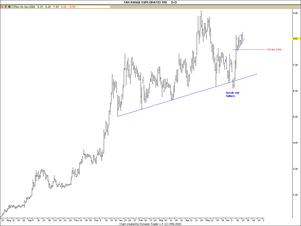
1.H%S pattern with rising neckline (not falling)
2 breakdown failure was followed by a dramatic rise.
3 This happened while gold did almost nothing!
4. look at the flagg formation it's what I call a "storm flagg" which is vey bullish and indicating price will break on the upside. (bullflaggs normally slope downwards)
end
![]()


No comments:
Post a Comment